From the farm to the market
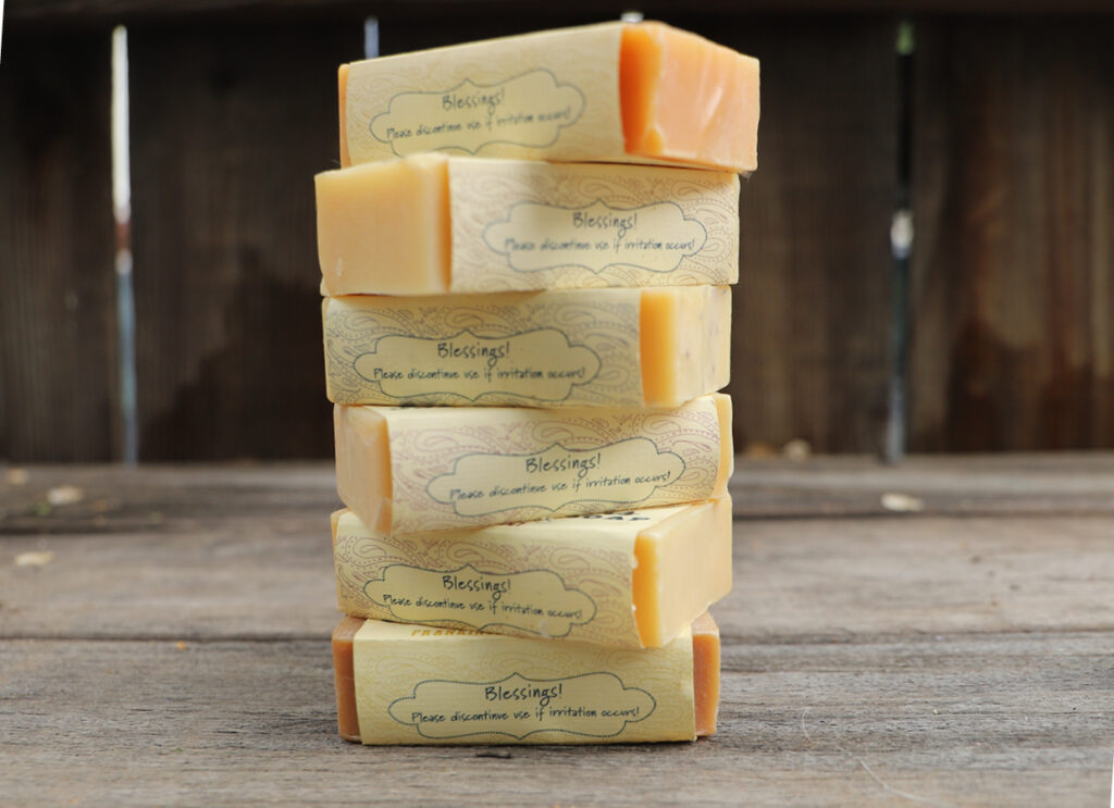
The design for Prairie Farm Goat Milk soap packaging encapsulates the essence of rustic charm and the journey from the farm to market. The logo, thoughtfully crafted, serves as the centerpiece, paying homage to the farm’s idyllic setting with its serene landscape and charming barn. Earthy color tones dominate the visual identity, evoking the natural, wholesome ingredients used in the soap. In a creative and cost-effective approach, the packaging maintains uniformity while distinguishing each of the eight unique scents through a diverse color palette. The labels, both in their cohesion and individuality, reflect the soap’s commitment to quality and the varied fragrances, capturing the essence of farm-fresh simplicity and the delightful diversity of nature’s offerings. Prairie Farm Goat Milk soap not only promises luxurious skincare but also tells a visual story of craftsmanship, tradition, and the beauty of the countryside.


