Go see “Bauhaus Typography at 100” in Aspen
at the Resnick Center for Herbert Bayer Studies
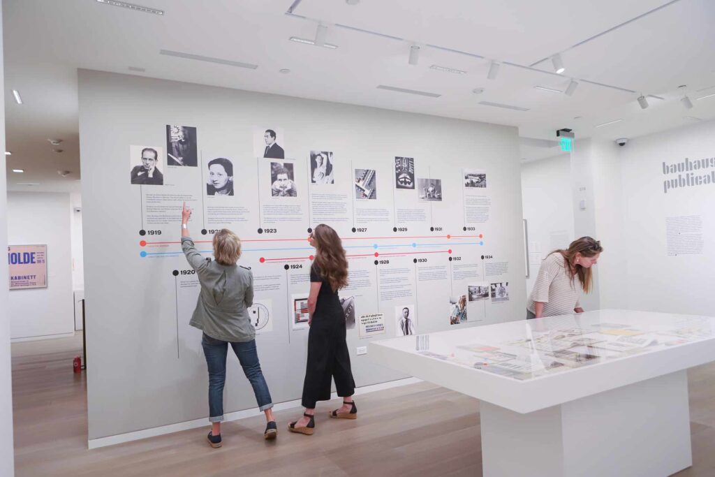
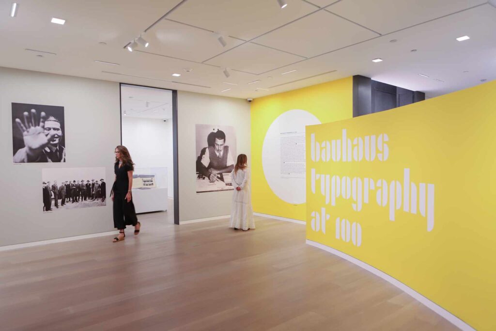
A collaboration with San Francisco-based Letterform Archive, the exhibition features work by Johannes Itten, Paul Klee, Wassily Kandinsky, László Moholy-Nagy, Joost Schmidt, and Herbert Bayer along with others whose innovative typographic contributions are often overlooked, including women such as Friedl Dicker.


What is typography?
Typography is the art and technique of arranging type to make written language legible, readable, and visually appealing. It has a rich history, starting from ancient hieroglyphics, evolving with the invention of the pen and papyrus, and reaching a significant milestone with Johannes Gutenberg, who invented the first printing press and produced the Gutenberg Bible.
During my second year in college, the design world began a new chapter with the advent of computer technology. This era marked a strange transition as we navigated the boundary between manual design work and the emerging capabilities of computers. The pressing question was: How do we integrate this new tool? Typefaces that were once crafted from metal became digital, bearing the names of their original creators, like Garamond, Futura, Baskerville, and Bodoni. This transition felt reminiscent of today’s AI, where we ponder if machines will take over creative tasks.
In my early career, I experienced this shift firsthand. At my first job at a newspaper, we transitioned from hand-laid wax type to electronic printing. It wasn’t until my third job that I truly appreciated the nuances of typography. As a designer, I was fortunate to learn from one of the best in the field, Kevin Mastin. He taught me that letters are more than just shapes; they have moods, styles, and features, much like people.
Everything we printed needed to be balanced, incorporating art, type, and space harmoniously. Choosing a font is not something I take lightly because, to me, it’s an essential part of the design that conveys the right message and emotion.
The Bauhaus Typography at 100 exhibit showcases a pivotal moment in history where a group of men and a woman made significant strides in design, blending art and typography seamlessly. It is a must-see for everyone, as it spans the variety of typographic art that should be appreciated just like any other form of art. The works featured are as iconic as the Mona Lisa and Picasso’s masterpieces. This exhibit is an essential part of art education for all ages, offering invaluable insights into the evolution of design and the enduring impact of typography.

